
Case Study · Luxury Real Estate
Veyra Bay
A sales website for a luxury waterfront development, rebuilt around how buyers actually choose a residence.
VEYRA Bay is a luxury waterfront residential development in the UAE. Its original website looked the part but worked like a brochure: beautiful imagery, static floor plans and a single generic enquiry form. We redesigned it around the buyer's journey, from a first look to an enquiry about one specific residence.

Client / Product Overview
A waterfront community of residences across several towers, marketed under the line “Where life meets the bay”. The website has to do the work of a sales gallery — it's where buyers explore, shortlist and decide which residence to ask about.
- Industry
- Luxury Real Estate
- Services Provided
- Project Scope
- UX audit of the existing site, buyer-journey strategy, a redesigned homepage and visual direction, and the product features behind it: a residence finder, residence detail with floor plans and views, side-by-side comparison, a contextual enquiry flow and a dedicated mobile experience.
Before
The Challenge
Buyers couldn't get from “this looks beautiful” to “this is the residence I want”. The audit found five problems: weak property discovery, floor plans shown as static images, no way to compare residences, an enquiry form with no context about what the buyer was interested in, and friction throughout on mobile.
Approach
From the problem to a direction
Strategy first, then the experience, then how it looks.
- 01
Discovery / Strategy
We annotated the existing homepage against real buyer tasks, then mapped the journey buyers actually take — Discover, Filter, Compare, Select, Enquire — and gave each step a screen with one job to do, rather than a section of one long page.
- 02
UX Approach
Every step carries the buyer's context forward. Filters feed the finder, the finder feeds residence detail, detail feeds comparison, and the enquiry arrives already knowing which residence it's about — so a buyer never has to re-explain what they were looking at.
- 03
UI / Visual Direction
A dark, dusk-lit direction built from the development's own photography: near-black grounds, a warm gold serif for display type, and a teal-to-magenta gradient reserved for primary actions. The redesigned homepage opens on “Where Life Meets the Bay” and lets the architecture carry the page.
The Build
Development
Built as a responsive sales website in which the finder, residence detail, comparison and enquiry screens all present the same residence information — unit, tower, level, view, price and availability — consistently. Prices are shown in AED, and the enquiry flow lets buyers choose WhatsApp as their contact preference.
Key Features
- 01Residence finder with bedroom, tower, price, floor, size, view and availability filters
- 02Residence detail that moves from tower to level, unit, floor plan and view
- 03Colour-coded floor plans showing where each unit sits in its tower
- 04Side-by-side comparison of size, bedrooms, floor, tower, view, price and availability
- 05Contextual enquiry that carries the selected residence, buyer intent and contact preference
- 06A dark mobile experience covering the finder, filters, details, floor plans, saved residences and enquiry
The Result
Final Product
A sales website that works the way buyers shortlist: find a residence, understand exactly where it sits and what it looks out on, compare it against the alternatives, and enquire about that residence specifically — on a large screen or a phone.
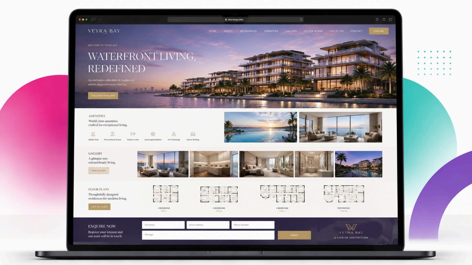
01 / 10Before: the original homepage, with static floor plans and a generic enquiry form 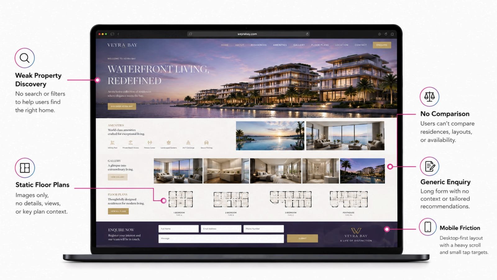
02 / 10The UX audit: five problems annotated on the original homepage 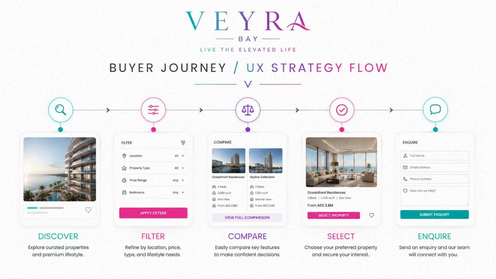
03 / 10Buyer journey strategy: Discover, Filter, Compare, Select, Enquire 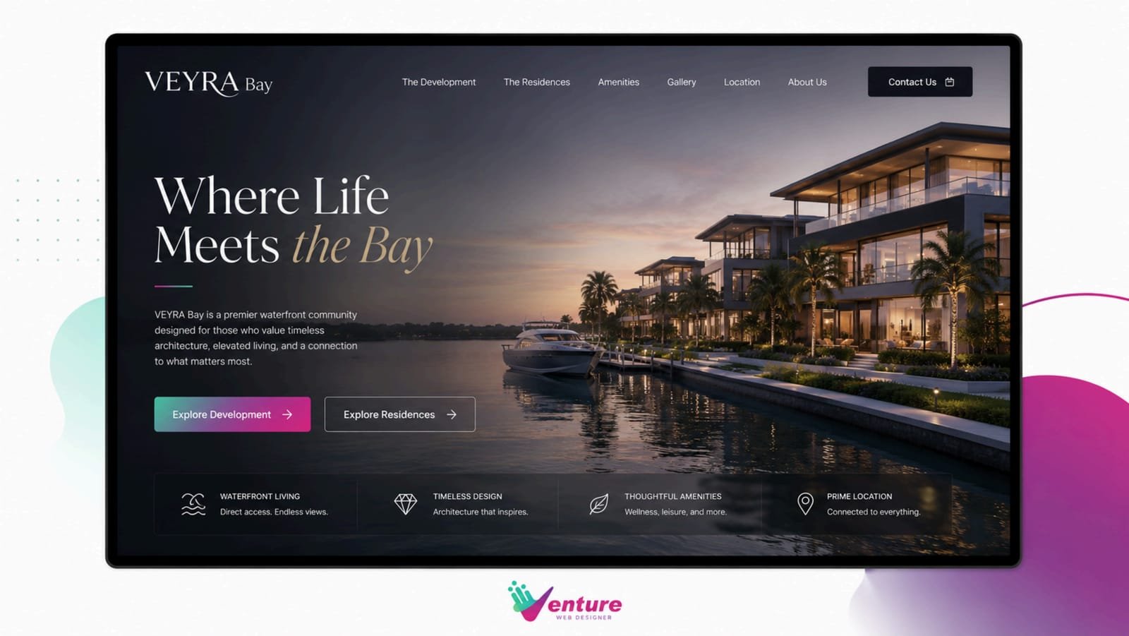
04 / 10The redesigned homepage, “Where Life Meets the Bay” 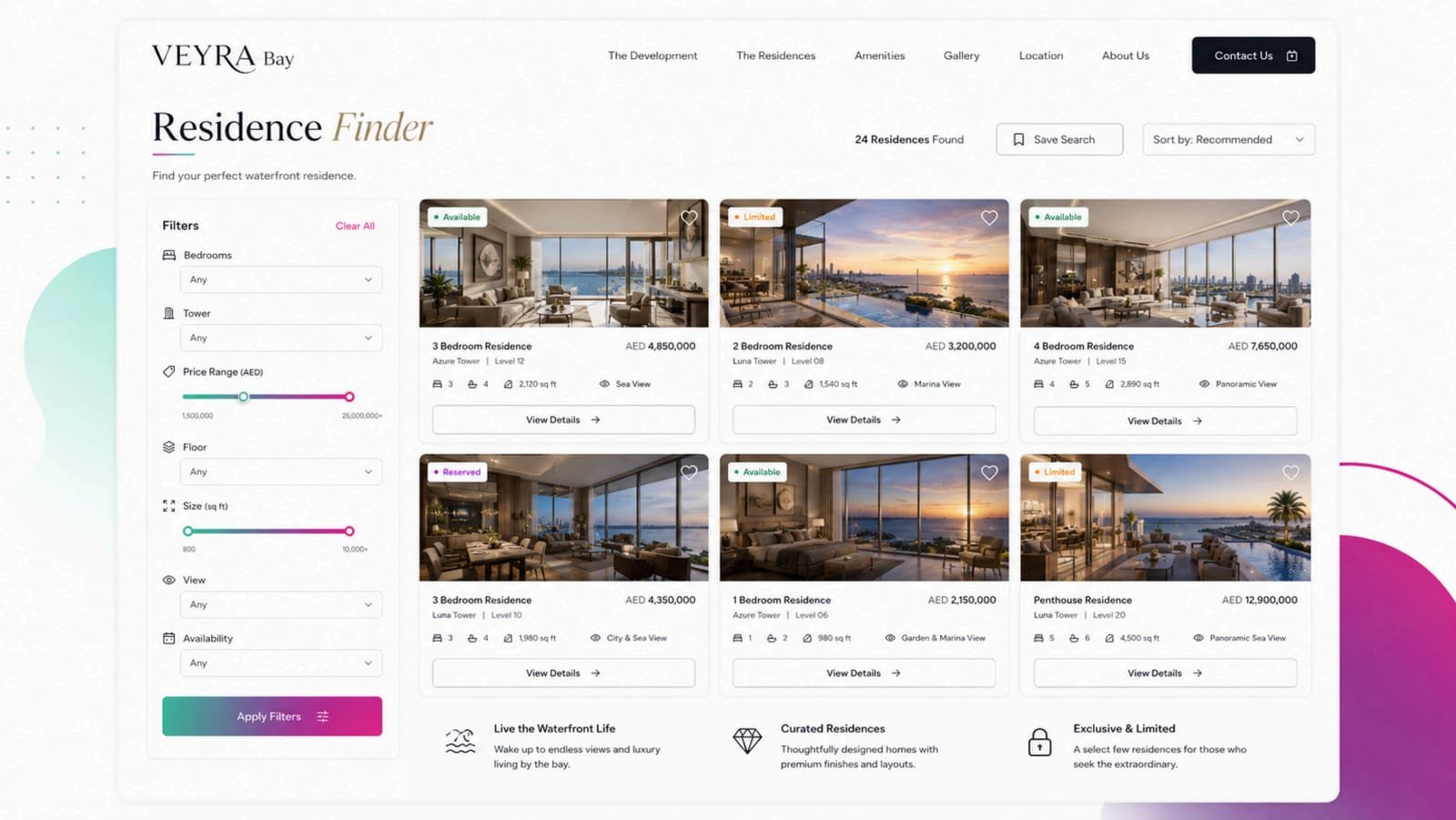
05 / 10Residence finder with filters and availability 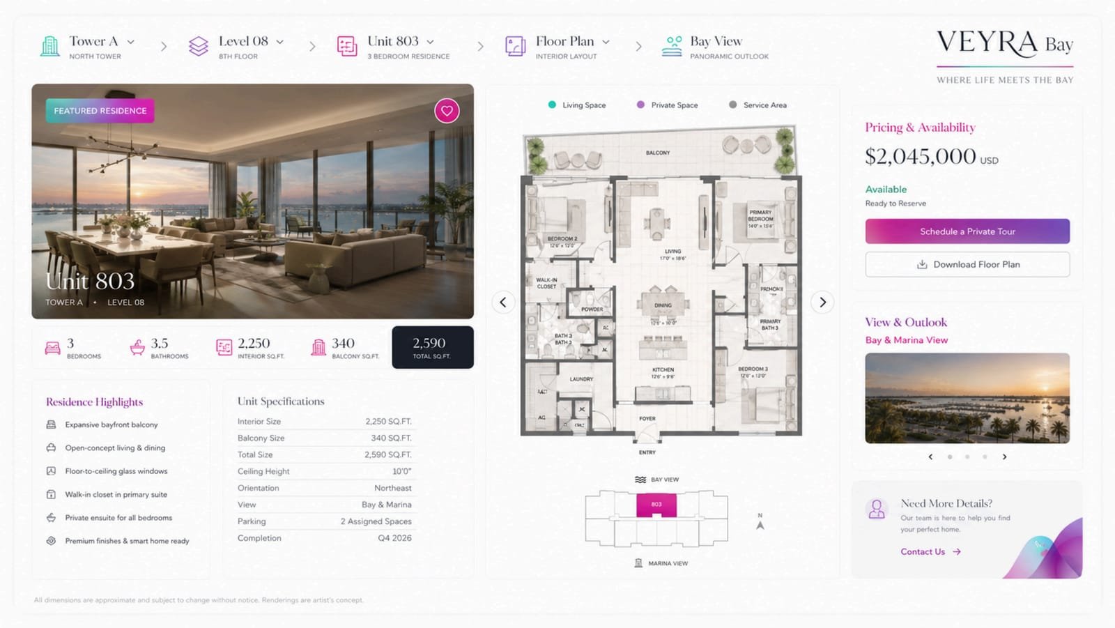
06 / 10Residence detail: floor plan, position in the tower and views 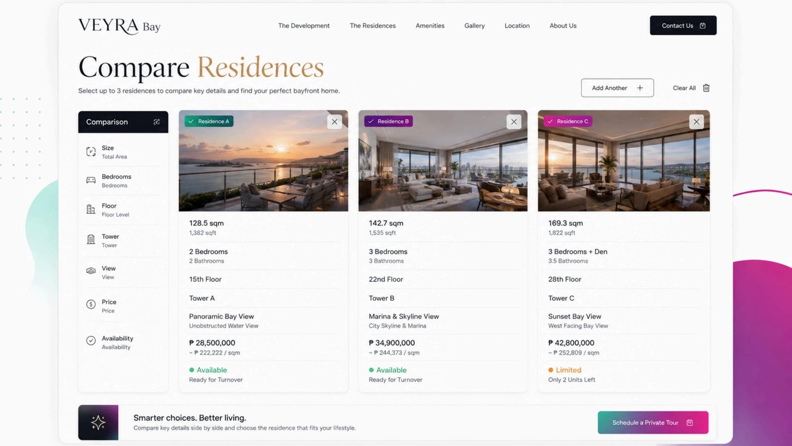
07 / 10Comparing three residences side by side 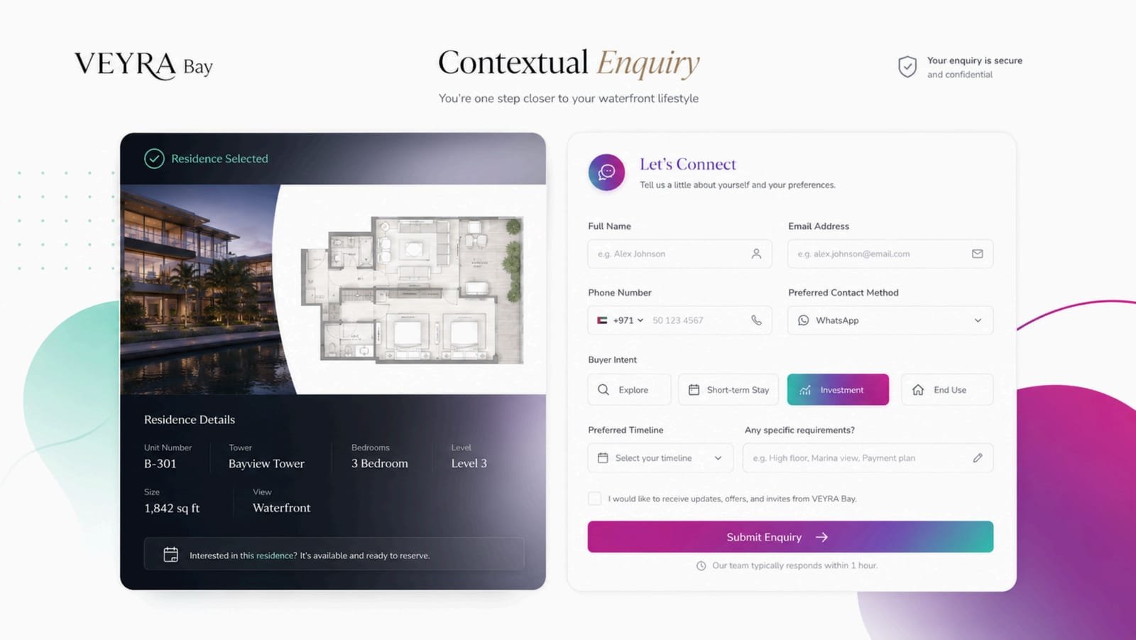
08 / 10A contextual enquiry that carries the selected residence 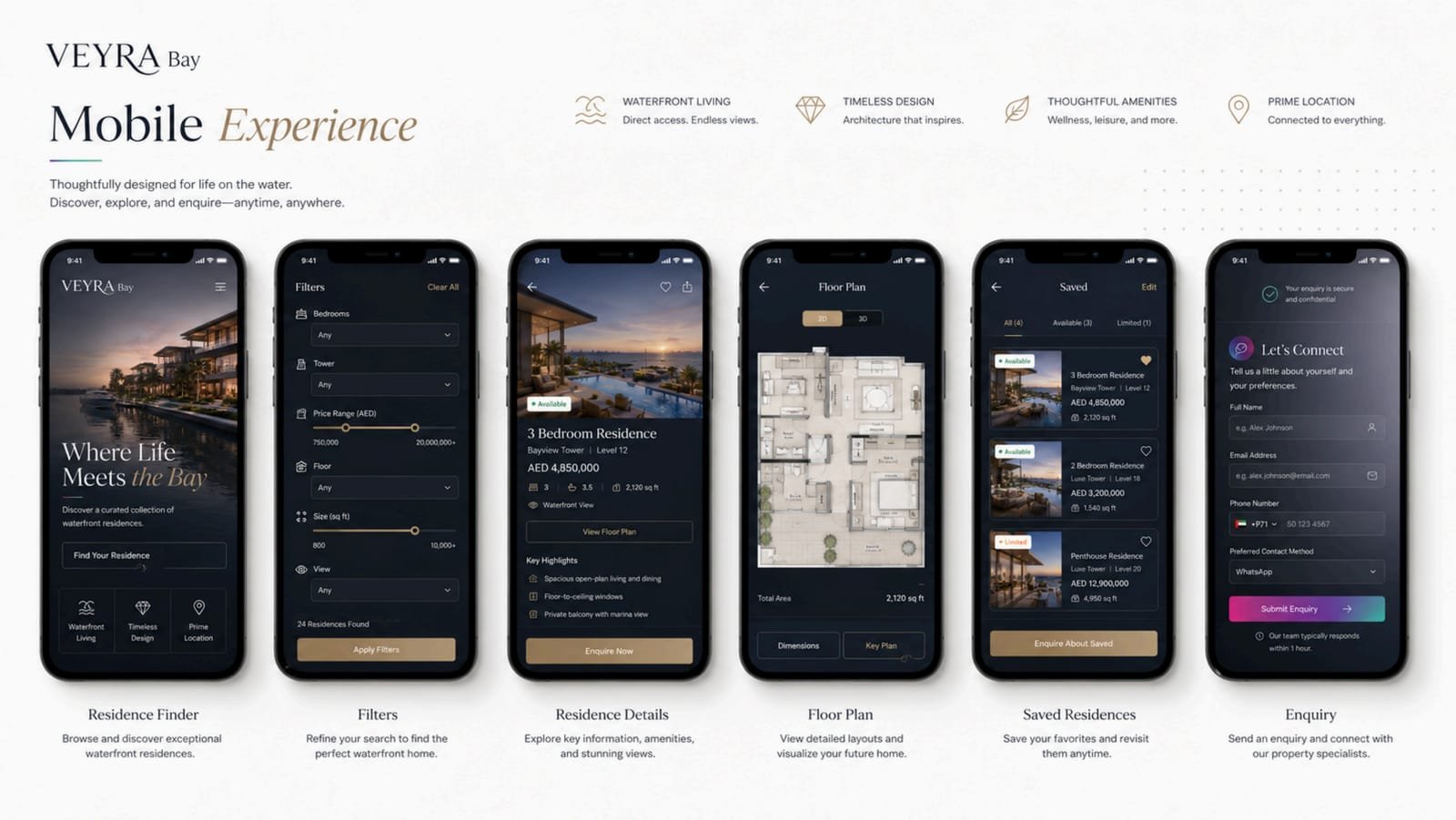
09 / 10The mobile experience, from finder to enquiry 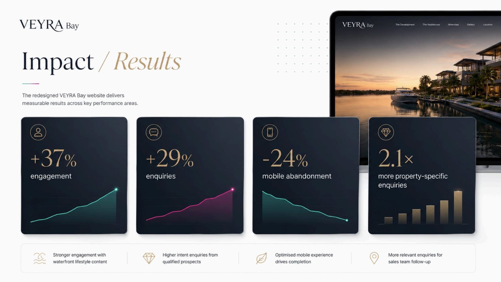
10 / 10Impact and results board


Outcome
Results
Buyers engage more deeply and enquire more often — and, the change the redesign was built for, far more of those enquiries now name a specific residence. Mobile abandonment dropped by almost a quarter.
- +37%Engagement
- +29%Enquiries
- −24%Mobile abandonment
- 2.1×More property-specific enquiries

Start a Similar Project
Planning something similar?
Tell us what you're building and what it has to do. We'll come back with how we'd approach it — the same way we approached Veyra Bay.
Services on this project